Store growth

Intro to Synthix

A practical seller course for building a profitable Synthix maker store: positioning, product pages, flexible services, quote deposits, pricing, followers, operations, courses and common launch problems.

Free36 lessonsStarter to selleradmin
Section 1

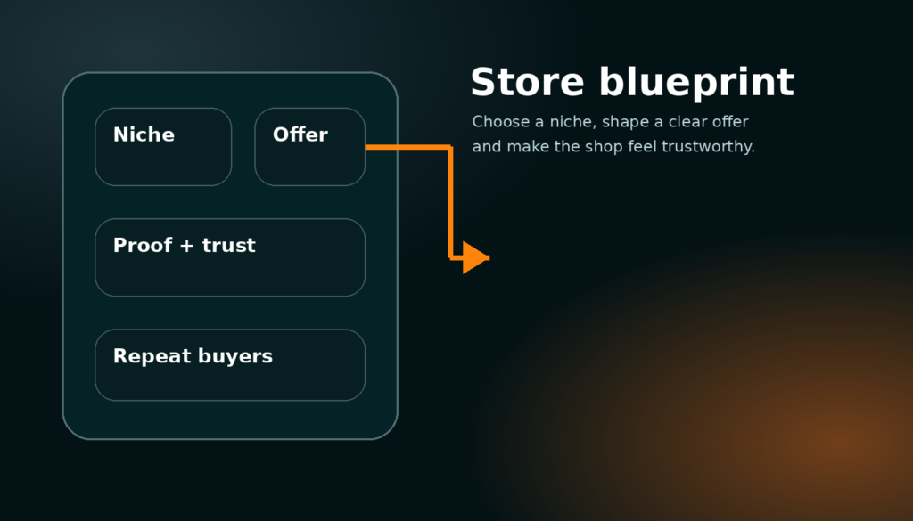
1. Store foundation and profitable positioning

Decide who the store is for, what you sell, why buyers should trust you and how the whole shop earns money instead of just looking busy.

Part 1

Choose a focused maker offer

13 min read

A profitable Synthix store starts with focus. Do not begin by uploading every project, every material and every random idea you can make. Start by choosing one buyer group and one problem you can solve better than a general marketplace. A buyer should quickly understand whether you make replacement parts, custom desk accessories, cosplay pieces, signs, workshop jigs, personalised gifts, CAD help, laser cutting, 3D printing batches or another clear offer. The clearer the offer is, the easier it is for the homepage, shop cards, service cards and search pages to send the right buyer to you.

A focused store can still grow later. The point is to make the first impression simple. If a buyer sees 3D prints, woodworking, digital art, random courses and repair services all mixed together with no explanation, they may not trust any one of them. A focused store says: “I help this type of customer get this result.” Once that promise is clear, products, services, courses and quote requests all support the same business instead of feeling like separate unfinished experiments.

Write the offer in normal language. A good example is “Custom 3D printed parts for desks, gaming setups and small repairs” or “Laser cut signs and display pieces for small businesses.” A weak example is “I make stuff” because it gives the buyer no reason to keep reading. This first decision affects titles, banners, tags, product descriptions, service pricing and even what pictures you should upload.

Specific choice: product store, service store or mixed store

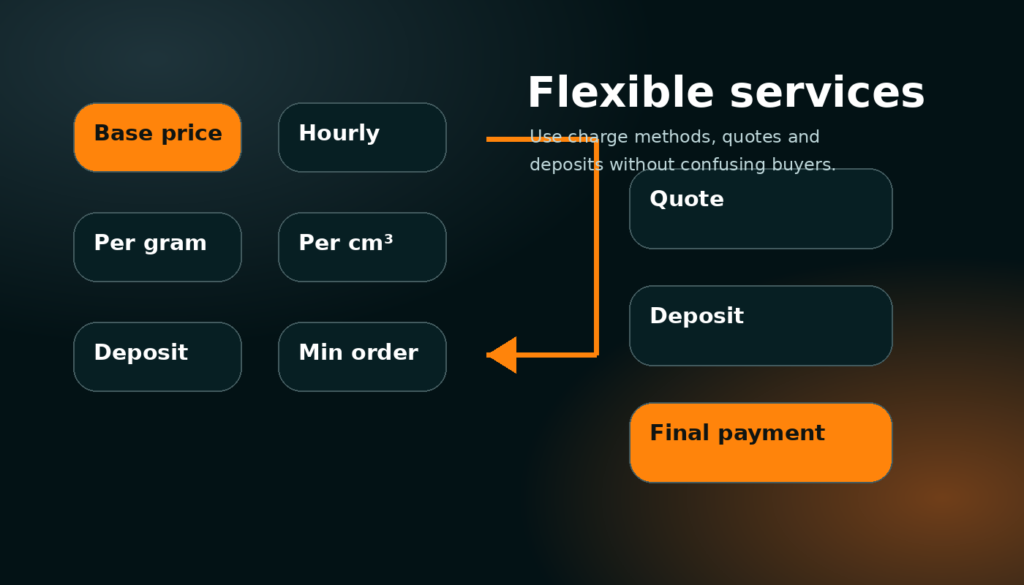
Use products when the buyer can understand the item, price and delivery before speaking to you. Use services when the buyer needs custom sizing, custom material, a file check, design time, local collection, unusual volume or a quote before you start. A mixed store works well when the fixed products act as proof and the service offer captures bigger custom jobs. For example, a maker could sell standard wall hooks as products and also offer “custom bracket design and printing” as a service. The product builds trust, the service creates larger order value.

Do not force every custom job into a fixed product just because checkout is easier. Custom work usually needs a conversation, a scope, a deposit and final approval. That is exactly why the service and quote system exists.

Common problem: the shop feels active but not profitable

This usually happens when the store has many small listings but no clear path to a valuable order. Ten low-priced products can look busy, but if each one takes too long to make, pack and support, the store can lose time. Add at least one higher-value service or bundle, and make sure every low-priced item either has a healthy margin, leads to repeat orders or demonstrates work that can turn into a custom quote.

When reviewing your own store, ask: what is the most profitable thing I want buyers to do next? The dashboard, shop layout and product cards should push buyers toward that action.

Part 2

Build trust before asking for money

11 min read

Trust is the difference between a marketplace listing and a real store. Add a proper profile image, a clean banner, a direct shop description, visible examples of previous work, realistic turnaround information and clear delivery expectations. Buyers do not only judge the item; they judge whether the maker looks organised enough to finish the job. A good banner should show your type of work or your brand style. A good profile image can be a logo, workshop mark or clean avatar, but it should not look like a missing placeholder.

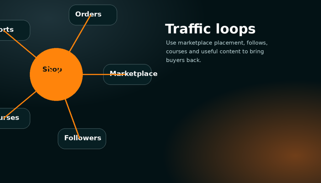
The storefront follow button matters because it turns one-time visitors into future buyers. When someone follows a maker, new products, services, courses or important posts can become notifications. This is more valuable than a simple favourite button because it gives the store a way to build an audience. A buyer may not need a custom part today, but if they follow you, they can come back when they do.

Use the settings page to keep store details accurate. If orders are closed, say so. If custom orders are open, make that obvious. If you only work locally or only ship within certain areas, put it in the service details so buyers do not waste time contacting you for work you cannot do.

Specific setup: what your storefront header should prove

The storefront header should answer four questions fast: what do you make, who is it for, how can someone buy or request work, and why should they trust you? Keep the first line short. Put detailed policies lower down. Use the follow section to show that buyers can stay updated. Use cards below the header to show products, services and courses in rows instead of creating a long confusing wall of text.

Common problem: buyers message but do not buy

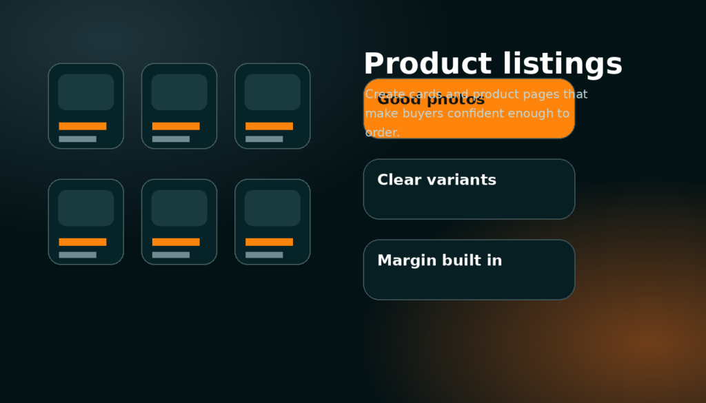
If many people ask questions but few buy, the page may be missing price guidance, turnaround, size options, examples or proof. Add a “starting from” price for services, clearer product variations and example images that show scale. Buyers often message because they are unsure, not because they are ready. Reduce uncertainty directly on the listing page.

Section 2

2. Product listings that convert into orders

Create product cards and product pages that are clear, priced properly and easy to buy without needing extra messages.

Part 1

Make the product card do its job

12 min read

The product card is a small sales page. It should show a strong image, a title that makes sense without clicking, a price, seller trust and only the most useful stats. The image should be landscape and easy to recognise at card size. The title should not be a long sentence. Put the exact material, use or size in the title only if it helps the buyer decide. Put detailed measurements and options inside the product page.

A product page should then remove friction. Show the main media first, put price and buy buttons close to the top, display variations clearly, explain shipping or collection and include recommended products below. The buyer should not have to scroll through a dashboard-style block of stats before seeing how to buy. If the product has colour, size or material options, each variation should have a clear price or a clear reason for requesting a quote.

Use default banners only as a safety net. A real product image is almost always better. If you have no final photo, use a clean render, prototype image or example image with a note. Do not let missing images become blank cards, because blank cards make the whole marketplace look unfinished.

Specific detail: titles, tags and descriptions

A strong title is specific but not stuffed with keywords. “Custom 3D Printed Cable Holder – Desk Setup” is clearer than “Amazing useful cool print.” Tags should describe category, material, use and buyer intent. The description should explain what is included, what the buyer can choose, how long it normally takes, what limitations exist and how to contact you if they need a custom version.

The first paragraph should sell the outcome. Later paragraphs can explain dimensions, material options, cleaning, installation, delivery and warranty. Buyers skim first, then read details if they are interested.

Common problem: lots of views but no orders

Views without orders usually means the card is interesting but the page does not create enough confidence. Check price, shipping, photos and description. Add a scale photo, a real example, a stronger title and a clear delivery estimate. If the price is high, explain why: material, labour, customisation, finish quality or included support. If the price is low, make sure it still covers your time.

Part 2

Price products with margin, not just material cost

10 min read

A profitable product price includes more than filament, wood, metal, resin or packaging. Include design time, machine time, failed attempts, finishing, electricity, platform fees, packaging, postage, customer messages and profit. If you only charge material cost, every order becomes a drain. A marketplace store should be built to survive repeated orders, not just win the first sale.

Simple pricing works best when the buyer understands it. If an item has variants, make the price difference logical. Larger sizes should cost more. Premium materials should cost more. Rush work should cost more. If the price changes too much based on buyer files or measurements, use a service listing and quote request instead of a fixed product.

Do not hide important costs until after checkout. Unexpected shipping, unclear deposits or surprise final payments reduce trust. If a product is fixed price, checkout should feel simple. If it is custom work, move it into the quote flow and explain the deposit clearly.

Specific pricing habit: set a minimum useful order

Small jobs can be profitable only if the minimum order protects your time. If a £3 item takes ten minutes of messages, setup and packing, it is not really a £3 job. Bundle small products, set minimum orders for services or offer packs. Buyers usually understand minimums when they are explained honestly.

Common problem: undercutting other makers

Being cheapest is not a stable advantage if you are paying with your time. Instead, compete with better photos, clearer communication, reliable turnaround, stronger examples, useful bundles and service quality. A clear premium store can earn more with fewer orders than a messy cheap store earns with constant stress.

Section 3

3. Flexible services and quote flow

Use service charge methods, messages, deposits and final payment requests to sell custom work without confusing buyers.

Part 1

Choose only the charge methods that explain the job

13 min read

A Synthix service can use base price, hourly price, price per gram, price per volume, price per unit, minimum order and deposit percentage. The important rule is simple: only select the methods that help the buyer understand how the job will be estimated. A 3D print service might show base price, per gram and minimum order. A CAD design service might show hourly price and deposit. A laser cutting service might show base price, per unit and material note. Displaying every charge method on every card makes the service look confusing and unfinished.

Service cards should show the selected charge chips only. For example: “Base £10”, “£18/hr”, “£0.08/g”, “Min £20”, “30% deposit”. The full service page can explain how the final quote is calculated. This gives buyers enough information to start a message without pretending every custom job can be priced perfectly on a card.

Flexible pricing is a trust tool when it is clear. It tells the buyer that the maker understands the job can change based on size, material, time and complexity. It should not feel like a hidden fee system. Always pair flexible pricing with examples, a typical turnaround and what the buyer needs to send you for an accurate quote.

Specific examples for maker services

3D printing: base setup fee, price per gram, optional file repair hourly fee and minimum order. Woodworking: base price, hourly rate, material note and local delivery area. Metalwork: quote-only service with minimum order, deposit percentage and safety limitations. Design help: hourly rate, starting package and revision limit. The better the service page explains the pricing model, the fewer low-quality quote requests you will receive.

Common problem: buyers compare services like fixed products

If buyers expect a single fixed price, add examples such as “small bracket from £8”, “desk sign from £25” or “CAD cleanup from £15 depending on file complexity.” Examples anchor expectations while still allowing custom quotes. Without examples, flexible pricing can feel vague.

Part 2

Run quote, deposit and final payment properly

12 min read

The quote flow is where custom work becomes safe for both sides. The buyer starts a message with the service. The seller asks for the required details, sends a quote and deposit request, then starts work once the deposit is paid. When the work is complete, the seller sends the final payment request with completion notes or proof, and the buyer pays the remainder. This keeps the maker protected from unpaid custom work while giving the buyer a clear record of what was agreed.

Every quote should include scope, price, deposit, timeline, what is included, what is not included, delivery or collection method and what happens if the buyer changes the requirements. If the job depends on buyer files, mention that the quote may change after file inspection. If a deposit is non-refundable after work starts, state it clearly before the buyer accepts.

Do not use messages as a messy side channel. The message thread is the project record. Keep quotes, deposits, decisions, proof and final payment in the thread so disputes are easier to understand later.

Specific quote checklist

Before sending a quote, confirm the buyer goal, dimensions, material, colour, file status, deadline, shipping method and acceptance criteria. For physical work, confirm the delivery address region or collection plan. For design work, confirm revision count and file format. For repair work, confirm risk and limitations. A clear quote is faster to accept and harder to misunderstand.

Common problem: scope creep

Scope creep happens when the buyer keeps adding small changes after the quote. Prevent it by writing what is included and how extra work is charged. A small change can be free if you choose, but the buyer should understand where the included work ends. This protects your profit and keeps the relationship professional.

Section 4

4. Traffic, followers and repeat buyers

Use the marketplace, shop layout, follows, helpful content and courses to bring serious buyers back to your store.

Part 1

Create a buyer path through the site

10 min read

A thriving store is not built from one page. Buyers can discover you through marketplace cards, shop cards, course cards, search, recommendations and follows. Each page should point to the next logical action. A product can point to a related custom service. A service can point to example products. A course can point to the tools, files or service that help the learner finish the project. The goal is to create a loop where a visitor can learn, trust, buy and return.

Use follows as a serious store feature. Followers are people who have shown interest in your maker activity. When you publish a new product, service, course or important update, followers can be notified. This is much more useful than treating engagement as a vanity number. Your aim is to build an audience of buyers who understand what you make and come back when they need it.

Keep the store consistent. If your products, services, banner, course and updates all point in different directions, followers will not know why they followed you. If they all support one maker identity, each new post makes the store stronger.

Specific traffic loop: product → service → follow → repeat order

A buyer may first find a fixed product. On that product page, recommend the matching custom service. If the buyer is not ready, the storefront follow button gives them a way to keep the maker. Later, a new product notification brings them back. This is how small marketplace activity can become repeat customer activity.

Common problem: content brings attention but not buyers

Attention is only useful if it connects to an offer. If a post or course shows your process, link it back to a product, service or shop section. Avoid content that gets views but does not help buyers understand what they can order. Useful demonstrations, before-and-after examples, build breakdowns and customer project stories are stronger than random posts.

Part 2

Use courses as a second revenue stream

11 min read

Courses should teach repeatable knowledge that buyers or other makers are willing to learn. A maker can sell a course about setting up prints, finishing resin parts, designing a simple product, using templates, preparing files, maintaining tools or running a store workflow. The course can include sections, parts, sub sections, videos, images, files and written lessons. It should feel like a complete product, not just a blog post.

Courses can also support your store. A free course can build trust and bring followers. A paid course can become a separate product. A course can include downloadable files, checklists, templates or example images. It should have a clear outcome: by the end, the learner should be able to do something specific.

The course page should be clean and readable. Put the banner and course summary at the top, put the course outline in a sidebar or compact panel, and put sections in a logical order. Avoid overlapping images and text. Course cards should look like the shop cards: image, title, level, parts, author and price.

Specific course idea for makers

Instead of “Woodworking basics”, a stronger course is “Build and price a custom desk shelf from first sketch to delivery.” It has a clear result, natural sections, useful images, file downloads and a reason for buyers to trust the maker. Specific courses sell better because the learner knows exactly what they are getting.

Common problem: the course looks broken or empty

Check that the course is published, the outline is saved, the post has an author, the featured image exists and the single course template is using the newest renderer. If the hero image overlaps the text, the page is using old course CSS or an old renderer. The safest fix is one final course template with unique styling classes.

Section 5

5. Daily dashboard, orders and customer handling

Use the dashboard as a working command centre for orders, messages, wallet, listings, courses and store health.

Part 1

A daily routine that protects profit

12 min read

A good dashboard is not just decoration. It should help you decide what to do next. Check messages first because quote delays lose custom jobs. Check seller orders next because paid work needs action. Then check listing health, courses, wallet and store readiness. The dashboard should be tightly stacked so important sections are visible without huge empty gaps. A busy maker needs a command centre, not a long page of repeated cards.

Use quick actions for the tasks you do most: add listing, create course, manage listings, open messages, view store, check settings and view wallet. KPIs are useful only when they lead to action. Listings tell you whether the store has enough inventory. Orders tell you whether work is moving. Reach tells you whether buyers are seeing the store. Followers tell you whether people want updates.

Do not ignore wallet and payout readiness. If a buyer pays but your payout details are unfinished, you create extra admin problems later. Complete the store readiness checklist before pushing for more orders.

Specific dashboard order of priority

Start with urgent buyer messages, then unpaid or active quote deposits, then seller orders, then shipping or proof uploads, then listings that need updates, then course or content improvements. This order protects revenue first and polish second. A beautiful store that misses messages will not grow.

Common problem: dashboard shows old sections or giant gaps

That means multiple dashboard renderers are still printing or old CSS is affecting the new layout. The fix is not another spacing override; it is one final dashboard template, one final shortcode and unique class names. The page template should call only the newest renderer.

Part 2

Handle delivery, proof and problems professionally

10 min read

Professional handling matters even for small orders. Confirm the order, explain timeline, send updates if anything changes, package properly and keep proof where possible. For custom work, attach completion images or notes before final payment. If a buyer has a problem, answer calmly and refer back to the agreed scope. The cleaner the order thread is, the easier it is to resolve issues.

Build policies that match your work. A personalised 3D print cannot always be returned like a normal stocked product. A service deposit may become non-refundable once work starts. A digital file might have different delivery rules. These policies should be clear before purchase or quote acceptance, not discovered during a dispute.

Profitable stores are reliable stores. Fast replies, honest timelines and clear proof can be as important as the product itself because buyers are paying a real person, not a warehouse.

Specific issue: late orders

If you are going to be late, message before the buyer chases you. Give the reason, the new timeline and the next checkpoint. Buyers are usually more patient when they are kept informed. Silence makes even a small delay feel worse.

Common problem: unclear final payment request

A final payment request should say what was completed, include proof if relevant, show the remaining amount and explain what happens after payment. Do not send a bare payment link with no context. Context increases trust and reduces disputes.

Section 6

6. Common problems and launch checklist

Fix the issues that stop a store looking finished: missing images, confusing prices, broken links, weak pages and unclear buyer flows.

Part 1

The profitable store launch check

14 min read

Before sending buyers to your store, test it like a customer. Open the homepage, marketplace, shop page, product page, service page, course page, cart, checkout, messages, dashboard, pricing and settings. Make sure the header and sidebar do not cover content. Make sure cards have images. Make sure product cards show product information, service cards show selected charge methods and course cards show course information. Make sure the follow button is visible on the storefront and that notifications make sense.

Test one real product purchase flow and one quote request flow. For products, check add to cart, buy now and checkout. For services, check request quote, message thread, deposit quote and final payment request. For courses, check free enrolment or paid checkout. A store is not ready just because the pages load; the money paths must work.

Use the downloadable checklist attached to this course. It is short on purpose. A maker should be able to review the store quickly every week and improve the weakest point first.

Specific problem: default banners or images look wrong

Real uploaded images should always be checked first. Default banners should only appear when no real banner or featured image exists. If a default banner appears even when you uploaded media, check the image lookup order. If the image overlaps text, fix the layout rather than changing the image again.

Specific problem: course page layout breaks

Course pages break when old hero CSS, old sticky sidebars and old content renderers all compete. A safe course layout uses one wrapper, one hero, one outline panel and one lesson column. Images should sit inside their section, not float over the text. The course template should call the newest renderer directly.

Part 2

How to keep improving without rebuilding everything

9 min read

Improve the site in small passes. Fix the most visible buyer problem first, then the most important seller problem, then the polish. Do not rebuild a working page just because one section is ugly. On a marketplace, working checkout, messages, quote flow and clear cards matter more than adding unfinished tools. A smaller complete site is more trustworthy than a huge site full of partial features.

For your own store, use the same approach. Improve the highest-value listing first. Add one better image, one clearer paragraph, one stronger price explanation or one better service example. Then check whether views, messages or orders change. Store growth is a loop: improve, measure, learn, repeat.

The aim of Synthix is not just to list things. The aim is to help makers build a real business around products, services, courses and repeat customers. Every feature should support that outcome.

Specific weekly review

Once per week, check your most viewed listing, your least clear service, your newest messages, your follower count, your orders and your wallet. Choose one improvement that can increase trust or profit. Update the listing, then leave it long enough to measure.

Common problem: adding too much at once

Adding products, services, courses and content all at once can make the store feel messy. Build the core offer first, then expand. A clean store with three excellent listings can beat a crowded store with thirty weak ones.